Tuesday, 28 December 2010
3. What Kind of Media Institution Might Distribute Your Media Product and Why?
After lots of research and enquiries I have narrowed it down to these two institutions. I feel that Bauer Media would be good as it publishes "Kerrang!", "Empire", "Mojo" and "Q" therefore it has a reputation for supporting music magazines, one of them target an audience of a similar age to mine. Also all those magazines are targeted towards men so mine would be different as it targets both genders.
The problem with choosing Bauer media though is that it already has 4 popular music magazines so I would have a lot of competition. IPC media distributes "NME", "Uncut", "Guitar and Bass" which all target a lot older generation than mine. Therefore competition is much less, yet they still have the experience of very popular music magazines.
Therefore my media institution will be IPC Media.
2. How Does Your Media Product Represent Particular Social Groups
This question seems some what hard for me as my magazine is all about unsigned artists therefore I cannot compare it with any famous artists. Therefore I am going to compare my unsigned artist, Tallis Morris to an example of a bunch of students as I created this magazine with their type in mind. My magazine is aimed for their age group, style and interests.
Excluding one women who is over the age of 24, looking at the rest they are all wearing very folk-styled clothes. If you compare their clothes with the artist I have chosen they are very similar. The urban kind of look really features in my images of Tallis, this compliments the browns in the clothes.
A group of students |
Tallis Morris |
If you look closely in both pictures of the student they all try something to make them look unique, e.g. glasses, hats, headscarves. This is a very important factor as every student wants to stand out from the rest and look unique. This is what I have been trying to create in my magazine by using quirky, rugged surroundings, and unusual props like the rug, chair and laptop. The main aim for me was to make my magazine stand out from the rest, to catch the eye or people my age so I really had to do a lot of research in order to pull this off.
1. In What Ways Does Your Media Product Use, Develop or Challenge Forms and Conventions of Real Media Products
Front cover
As my target audience is 16-24 I have used a young women who is in this age range for my main feature.
As she is the main feature of the magazine I have her on the front cover, in the middle of the page, and layered above everything else. Like Kerrang I have used an almost in your face image in colour. I have edited it using photoshop to make it very dramatic.
Again like Kerrang, I have used the wripped effect to give it a bit of a daring effect.
Like any other magazine I have included a line at the bottom of the page which almost gives the front cover a border. This line shows all the artists at the bottom of the page to look as if the the magazine is jam packed full of features.
I have used a common technique of adding a circle of information which looks like a stamp. It looks almost as if it was the last feature to be put in the magazine. I have used very common house colours of red, black and white, but have also added parts of grey.
Contents page
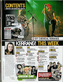
My contents page is quite organised but also messy at the same time. The text is in colums to make it easy to read, and colour coordinated to make it easy to understand. Like every other contents page I have seen the majority of it is pictures, although it is the page that needs to hold the most information.
I have used large, different coloured numbers in order to stand out and make it easy to interpretate where each feature is.
I have included an editors post just like kerrang so that the audience can feel as though they personally know who this person is. It makes the magazine almost 'homely' and recognisable if the same person is editing it every time and having their own view on this months magazine.
I have very clear captions on each photo used on the contents page like all other music magazines so that it is clear to the audience about what each picture tells you.
I have kept with the house colours, and also style of font throughout.
Double page spread
For my double page spread I haven't kept it very traditional in that it isn't really a picture, then an article but they are both merged into one. I have used just one, main image and then layered the text on top. The difference between my double page spread and main stream ones is that my article is very long compared to most.
It is very rare to do a question and answer interview, and it has been mentioned that NME have done this before. Personally I find it easier to read question and answer rather than a big long paragraph of text and I personally think that the majority of people aged 16-24 would. I have used a common technique that is taking pictures of the artist in a photoshoot rather than live images. I have done this to represent real intensity of the article. I would like people to feel as if they know her personally and not just someone who sings.
Your Response
I used a website called Survey Monkey which is a way of creating a questionnaire to evaluate my magazine. I have used this as a way of hearing how to improve my magazine to suit their needs. I have sent this by facebook or email to people in my target audience age group.
YOUR RESPONSE -
YOUR RESPONSE -
Thursday, 9 December 2010
Latest contents page
I have made minor changes to my contents page. I have changed the editors picture as the previous one was too dark and hard to see.
I have changed the colour of the 'cover' stamp as the blue wasn't one of my house colours.
I have also added more features onto my contents information.
I have changed the colour of the 'cover' stamp as the blue wasn't one of my house colours.
I have also added more features onto my contents information.
Tuesday, 7 December 2010
Latest Front Cover
I have changed the whole RHS of my front cover by using different images and making them into free posters.
I have also changed the logo for the magazine so that it's larger and more recognisable, it stands out from the rest.
I have re-positioned the 'tallis morris' text so that it is away from the logo more.
I have also moved the free e.p so that I could use more room for the free posters.
I have also changed the logo for the magazine so that it's larger and more recognisable, it stands out from the rest.
I have re-positioned the 'tallis morris' text so that it is away from the logo more.
I have also moved the free e.p so that I could use more room for the free posters.
Sunday, 5 December 2010
Second Draft of double page spread
I have improved my double page spread by compacting the writing to size 8, and using a bigger image that takes up a lot of the page. I think the only problem with this is that it is not like any other music magazine's double page spread. This is a bit daring because the audience might not like change. But then again it might be a good idea as it is original therefore readers would remember it as being unique and that's what I want my magazine to portray.
Second Draft of Contents page
I have improved my contents page so that it has more ordered colours. I produced my contents page before my title page with no real idea on house colours. Therefore I have now changed my contents page to co-inside with my colours of title page.
Second Draft of Title page
My aim for this front cover is for the first thing you see when you look at this front cover is her face. I personally think that this works well. I like the way she overlaps over the grey strip as it makes it look 3D. By using a different image you can also see her name more clearly which makes it easier for the audience to see.
Friday, 26 November 2010
DRAFT of double page spread
This is my double page spread. Originally this wasn't how this page was presented but then I had to bare in mind the crease down the middle. It worries me how this page contains so much information and how the main image is very small but I personally think it is original. The ripped boxes give it the informal look, and I have edited the image in order to make it look more dramatic.
Improvements
In order to improve my double page spread I need to either cut down the text or make it smaller. I also need to make the image a lot bigger, as on most music magazines the image takes up at least half of the page.
Improvements
In order to improve my double page spread I need to either cut down the text or make it smaller. I also need to make the image a lot bigger, as on most music magazines the image takes up at least half of the page.
DRAFT front cover
This is my draft of my front cover. I have used to general house colours with the exception of the vibrant colours of the E.P. I have been inspired mostly by Kerrang but taken snippets from a lot of different magazines.
I have overlapped the image of Tallis over her name to give it a 3D effect, this also links the name to the artists so the readers are clear as to who it is.
I have used very bold, large text so that the magazine stands out from all the rest.
Improvements
In order to improve my front cover I need to use a different image that has her face in the middle of the page so that she stands out more.
Also her name is not clear enough so people would not recognise who she is with a quick glance.
Sketch of double page spread
I want my double page spread to be very atmospheric but also contain a lot of information at the same time. The picture is going to be in colour and the text in black. I just have to try out different fonts and positions in order to achieve this.
Sketch of front cover
This is a sketch of my front cover. I want to use a close up of Tallis with direct address so that it indicates that there is in fact a deep and personal interview about her life. By using a close up it gives the feeling that you know her well, also with a quick glance people would be able to recognize her quickly.
My aim is to make the page look as busy as possible but no too over crowded. This is so that there looks like there's a lot of content in the magazine.
I will use my house colours, Black, White, Grey and Red so that the magazine is recognizable and stands out.
My front cover will advertise a free E.P so that this lures people into buying it.
Edited pictures for front cover
As one of my house colours is red, every little bit of red on this photo is still in colour but the rest black and white. I used photoshop in order to create this effect.
The problem with this is that the first thing you look at when first glancing at this picture is the red of the guitar, this is not my aim as the most important feature of my cover is the girl herself therefore I need her to be the first thing you see.
Tuesday, 23 November 2010
Researching music magazines
Check out this SlideShare Presentation:
Researching music magazines
View more presentations from georgiatomkins.
Sunday, 21 November 2010
Wednesday, 17 November 2010
Contents page
My aim for my contents page is for it to look quite informal, almost like a scrap book. I want the pictures to range from live pictures, to very honest, home life pictures. I want the reader to feel as if they know the artist really well. Although the pictures are scattered I have now improved it in that they have captions telling the reader what the picture is about, or who is in the picture.
The contents are very basic and easy to read, I have done this because teenagers relate more to pictures than a paragraph of text.
DRAFT contents page
This is my first draft of a contents page. If you click on the picture it will show you an annotated version, to show all the improvements needed.
Tuesday, 9 November 2010
Evaluating my presentation
Today I did a presentation in role, as if I was about to publish my own music magazine. Personally I think that all my ideas were original and justified, but maybe needed to be explained a bit more.
For example, I wanted to take a risk instead of doing the norm, and publish a magazine that is completely different and ideal for bands/artists that are not signed, for those looking to sign artists, and for those who generally don't like who's in the charts at the moment. I could have explained more about who would have been in the magazine, like music students from universities, song writers who are currently trying to write songs for famous artists, the top artists talked about on youtube/facebook etc. I didn't explain in enough detail about what free gift there would be. For example, the CDs would be CDs of the artist on the front cover. This will advertise the not signed artists and give the students reading this magazine a chance to listen to something new.
In my presentation I could have used more visual ideas. I could have shown them my front cover ideas rather than describing them, and told them the name of my magazine and shown the logo. This would give the audience more of an understanding of my proposal and really indicate to them that i know for certain what my plans are for my music magazine.
Overall I hope that my presentation got my point across to the audience from being unique, well spoken, and understandable.
Friday, 5 November 2010
Front cover drafts
These are a few drafts of what my front cover of my music magazine could look like. The top two have a little problem as she doesn't look at the camera which is very uncommon for magazines. Also these photos are not my own, but one's that her or her friends have taken.Therefore I would not receive as many marks as I would if they were my own. In terms of the style of layout I am very fond of the top one as it looks more interesting and asthetically pleasing.
Questionnaire results
By looking at these results I can see that the majority of people in this age catergory listens to Indie music. Despite the fact that this is the most popular all genres were picked. This means that in order to create a successful magazine I will need to include most, if not all genres.
I can also see that most people access their music through downloads. This encourages me to produce my own music download site in order to promote my magazine more. I could sell unsigned records for very reasonable prices. Not only do people download people but they listen to them on youtube. If I were to create a website for my magazine I could include videos of the artists from youtube. Not only this but they listen to CDs, this encourages me to include free gifts like CDs.
Looking at the price range that people would pay for a magazine, most people would pay £2 for one. Interestingly people that I spoke to said that they would pay up to £4 just because NME and Kerrang cost that much, and they are worth spending £4. Maybe I could make my magazine good enough to be worth £4.
Questionnaire
I have created a questionnaire in order to evaluate what people in the age group 16-24 really like in music magazines. I have created 10 questionnaires for 10 seperate people to fill out. I will analyse these results and use them to produce a popular and interesting magazine.
Subscribe to:
Posts (Atom)